Green & White Murano-Style LED Chandelier (French Luxe)
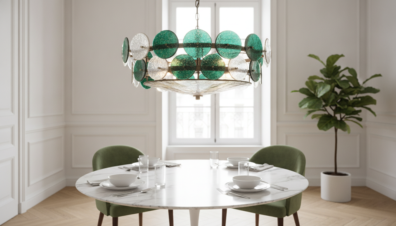
Murano Crystal Glass French Luxury Green & White LED Chandelier Light
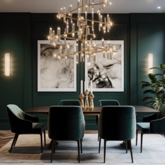
A statement chandelier that pairs Murano-style crystal glass with a French-inspired silhouette, finished in green and white tones and designed around efficient LED illumination. It’s suited to formal dining areas, grand entryways, and living spaces where color, sparkle, and layered light are meant to be the focal point. For more guidance, see [PDF] STUDY DAYS ON VENETIAN GLASS Approximately 1600’s.
What Makes This Chandelier Stand Out
- Murano-style crystal glass look with green-and-white accents that can read classic or contemporary depending on nearby finishes and furniture lines.
- A French luxury silhouette designed to act as a sculptural centerpiece—not just functional overhead light.
- LED-based illumination that supports strong brightness with lower heat and energy use than many traditional lamp types (helpful for glass-heavy fixtures).
- Best treated as the room’s primary visual anchor; keep secondary lighting (table lamps, picture lights, simple sconces) understated so the chandelier stays in control.
Color, Materials, and How They Read in Different Rooms
Green-and-white glass is expressive, but it doesn’t have to feel loud. The green highlights can echo natural elements already present—plants, stone, warm woods, or brass details—so the color feels intentional rather than decorative “extra.” In rooms that lean neutral, the green reads like a jewel-toned accent that brings depth without requiring a bold wall color. For further reading, see Chandelier – Wikipedia.
The white glass components keep the fixture airy, which is especially important when you want a luxurious profile without tipping into heaviness. With crystal-style surfaces, sparkle is part of the design language: you’ll see more of that glittering effect when the room has a bit of contrast (darker woods, deep paint, textured plaster, or even matte cabinetry) to set the reflections off.
Metal pairings that tend to look polished with green and white include brushed brass, polished nickel, and black accents. To keep the palette coherent, pick one dominant metal finish across the room (cabinet hardware, curtain rods, mirror frames) and let the chandelier act as the standout detail.
Lighting Quality: Brightness, Color Temperature, and Atmosphere
Because glass multiplies highlights, the most flattering light for dining rooms and living spaces is usually warm-to-neutral white rather than an icy cool tone. Cooler light can look sharper on reflective surfaces and may emphasize glare. For a chandelier that’s as visual as it is functional, dimming is a major advantage: bright for cleaning, lively gatherings, or detailed tasks, and softer for evenings when you want the glass to glow rather than sparkle aggressively.
Comfort improves when the chandelier isn’t the only source of illumination. Add ambient layers—recessed lighting, wall washing, or discreet sconces—to prevent a “hot spot” effect beneath the fixture and to reduce harsh contrast across shiny glass. In taller rooms, stronger ambient layers also help balance the chandelier’s visual prominence so it feels integrated instead of floating in a dark ceiling volume.
For more background on LED efficiency and performance, see the U.S. Department of Energy guidance on LED lighting. For general safety and certification considerations, UL Solutions provides lighting resources, and the Illuminating Engineering Society (IES) publishes widely used lighting recommendations.
Sizing and Placement Guide
Placement is where a luxury chandelier shifts from “pretty” to properly designed. In dining rooms, the fixture should be centered over the table and visually proportional—large enough to feel intentional, but not so wide that it crowds the table edges. In entryways and stairwells, confirm clearance and evaluate sightlines from multiple angles (front door view, landing view, upstairs railing view). For living rooms, the cleanest look is typically centered over the main seating zone or coffee table and aligned with other architectural cues like a fireplace, ceiling medallion, or beams.
Hanging height should preserve head clearance while still feeling connected to the room. If the chandelier is too high, it can read like ceiling décor rather than lighting; too low, and it can interrupt movement and feel visually heavy.
Quick Placement Checks (Practical Rules of Thumb)
| Location | Placement target | Common clearance goal | Notes |
|---|---|---|---|
| Dining table | Centered on table | Bottom of fixture typically 30–36 in above tabletop | Adjust higher for very tall ceilings or taller centerpieces |
| Open foyer/entry | Centered in main void | Maintain comfortable head clearance in walk paths | Consider views from upstairs railings and the front door |
| Living room | Centered on seating/coffee table | Keep out of direct eye line when seated | Use dimming to prevent glare on reflective glass |
| Bedroom | Centered or over bed zone | Avoid low hangs near closet paths | Pair with bedside lamps for layered light |
Installation and Electrical Considerations
Care and Cleaning for Crystal-Style Glass
Styling Ideas: Making Green & White Glass Feel Intentional
Shop In-Stock Picks
- Murano Crystal Glass French Luxury Green & White LED Chandelier Light
- 55PCS Interlocking Drainage Floor Tiles
- Cactus Tall Cat Tree for Large Cats
FAQ
Can this chandelier work with a dimmer switch?
Yes, as long as the LED driver in the fixture supports dimming and the wall dimmer type is compatible (often ELV/trailing-edge for many LED loads). If you’re unsure, confirm the driver specs and have a qualified electrician match the dimmer to prevent flicker or limited dimming performance.
Is crystal glass difficult to keep clean?
It’s manageable with routine care: dust regularly with a microfiber cloth and do an occasional gentle wipe for fingerprints. Avoid abrasives and dry immediately after any damp cleaning to reduce water spots and keep the glass looking crisp.
What rooms suit a green and white glass chandelier best?
Dining rooms, entryways, formal living rooms, and stairwells are ideal because they give the fixture space to read as a centerpiece. Keep the surrounding palette calm and coordinate metals (brass, nickel, or black) so the green-and-white glass looks elegant rather than busy.









Leave a comment